At Wellington’s most scenic and visited location, the design challenge was to build a way-finding system helping visitors travel to/from the Cable Car, orientate themselves on arrival and plan an experience aligned to their duration of visit.
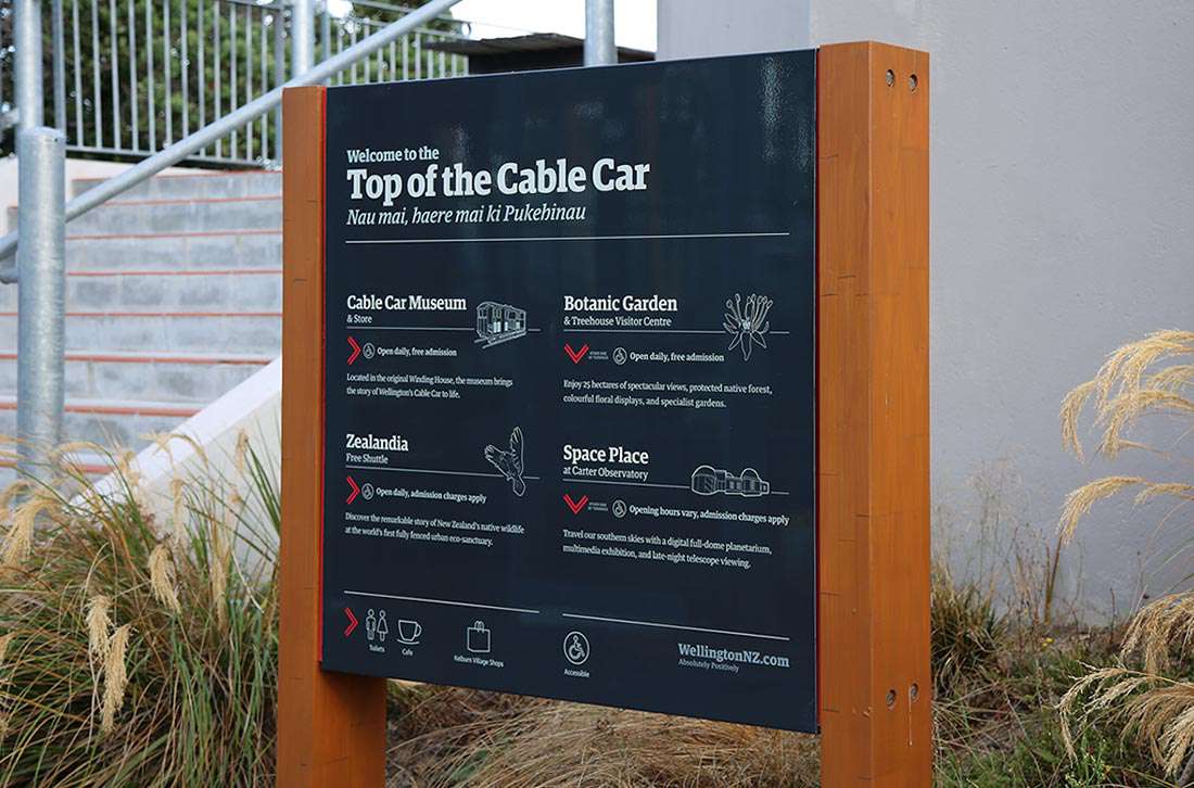
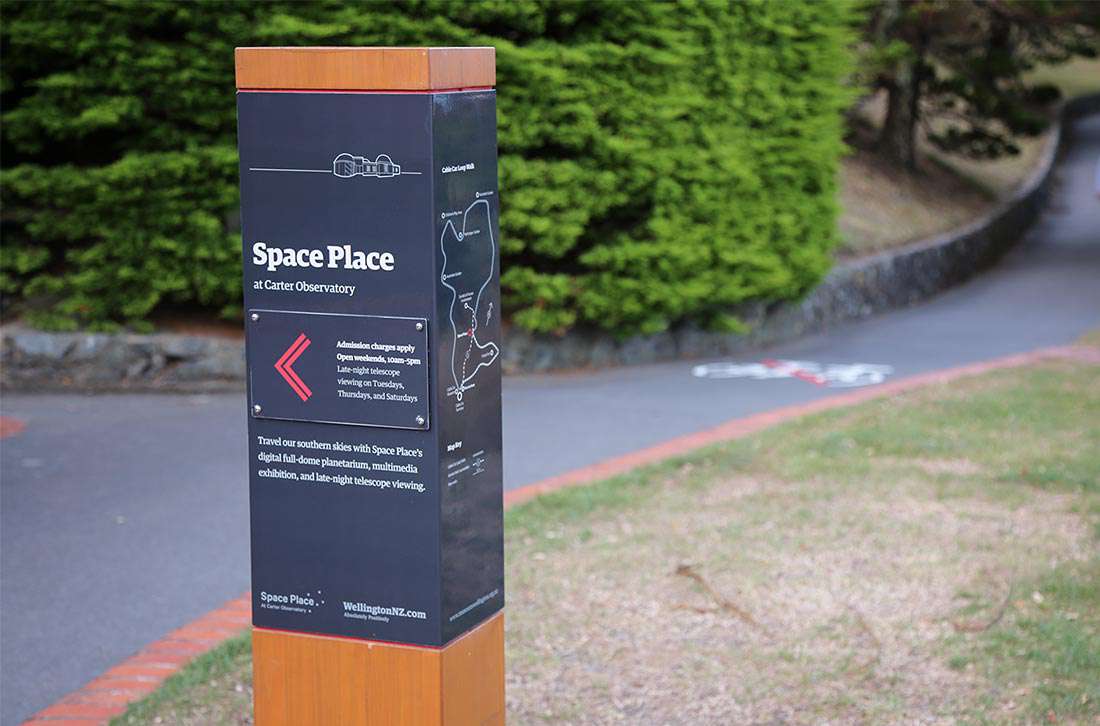
A key part of the design process for these signs was to incorporate several different stakeholders and their brands and to create homogenous yet recognisable designs that would represent their organisations. Materials were chosen to match the aesthetic of the new terminus building and the colour palette complements the latest palette being used by the council.
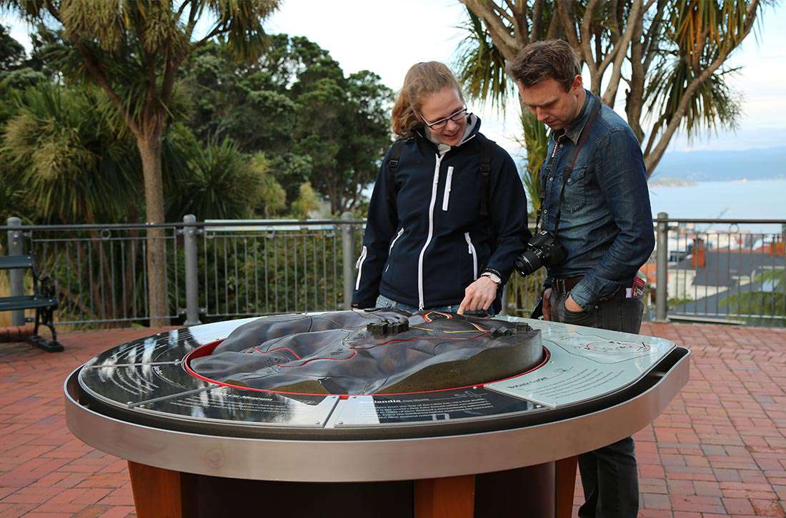
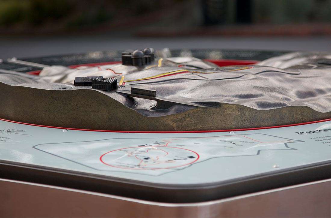
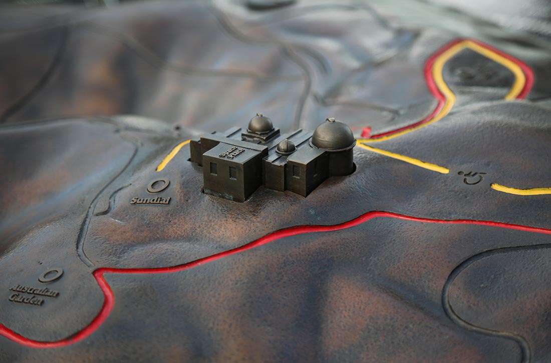
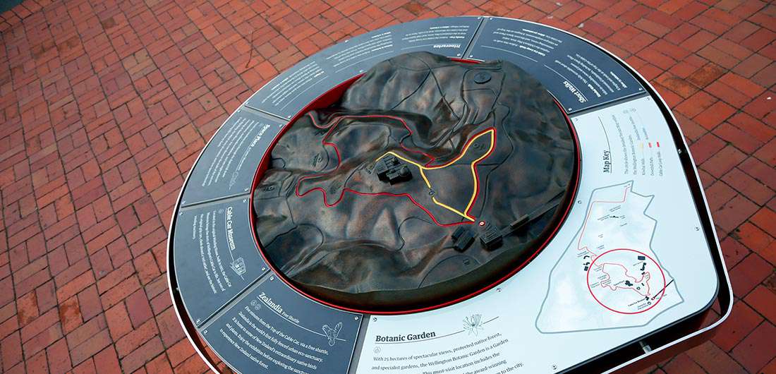
The centrepiece to the experience is the bronze-cast 3D map, complete with mapped routes for visitors to walk and iconic pieces, cast and welded onto the landscape. It helps give visitors their bearings and understand the steep terrain.We connected pathways through well-placed signage with maps and clear directions. We also utilised existing bollards around the lower CBD that would lead visitors to the Top of the Cable Car along popular routes.
Whether it be the Cable Car Museum, Zealandia, the Botanic Gardens or Space Place, the simplified iconography of these attractions is incorporated into the design of the signs, and helps to direct visitors to the landmarks and recognise them along the way.
Seeing visitors use the signs firsthand was incredibly satisfying and the 3D bronze-cast map is particularly popular. Visitors can find their way to the Cable Car with ease, and once there, become orientated to visit the other excellent attractions on offer.
